Role: Co-UX Designer, Co-UI Designer, Data Collection and Analysis
Focus/Skills: Website Redesign, User Experience Design, User Interface Design
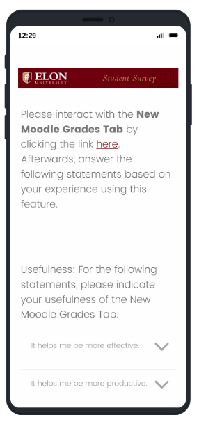
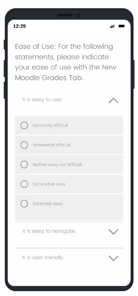
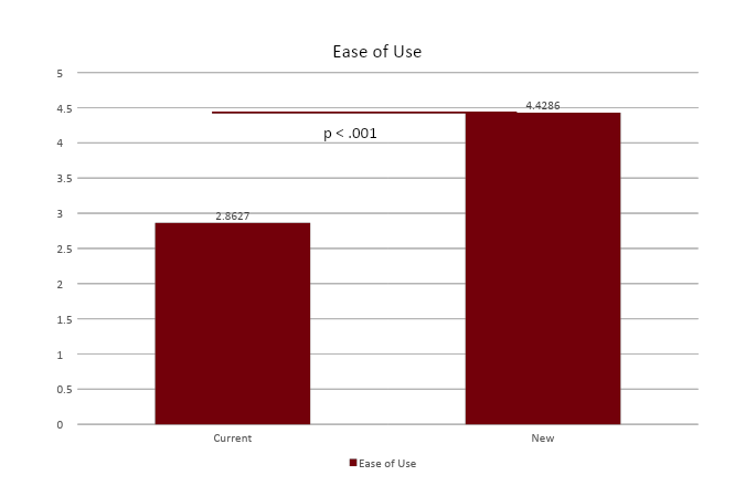
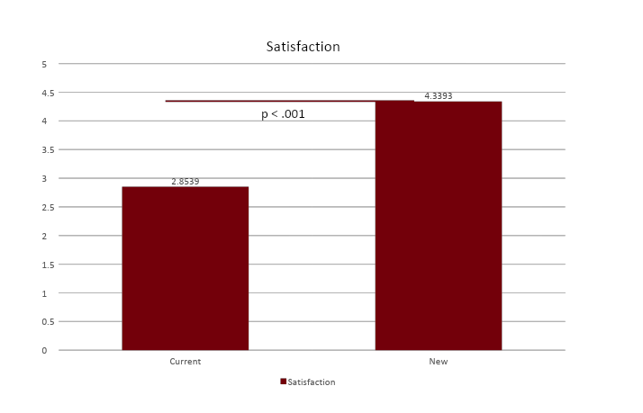
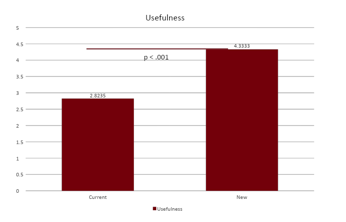
Technology: User-Centered Design Process, Otter.Ai, Figma, Qualtrics, SPSS Statistics
Problem Statement & Purpose:
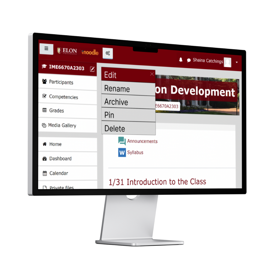
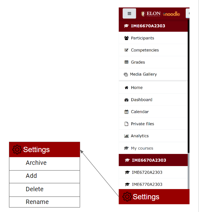
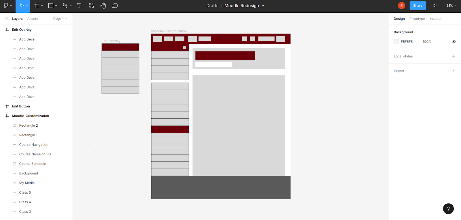
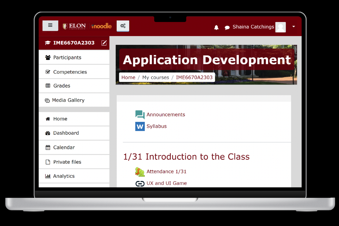
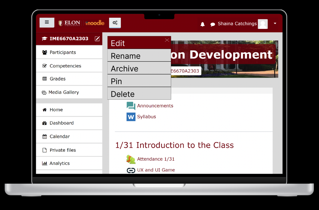
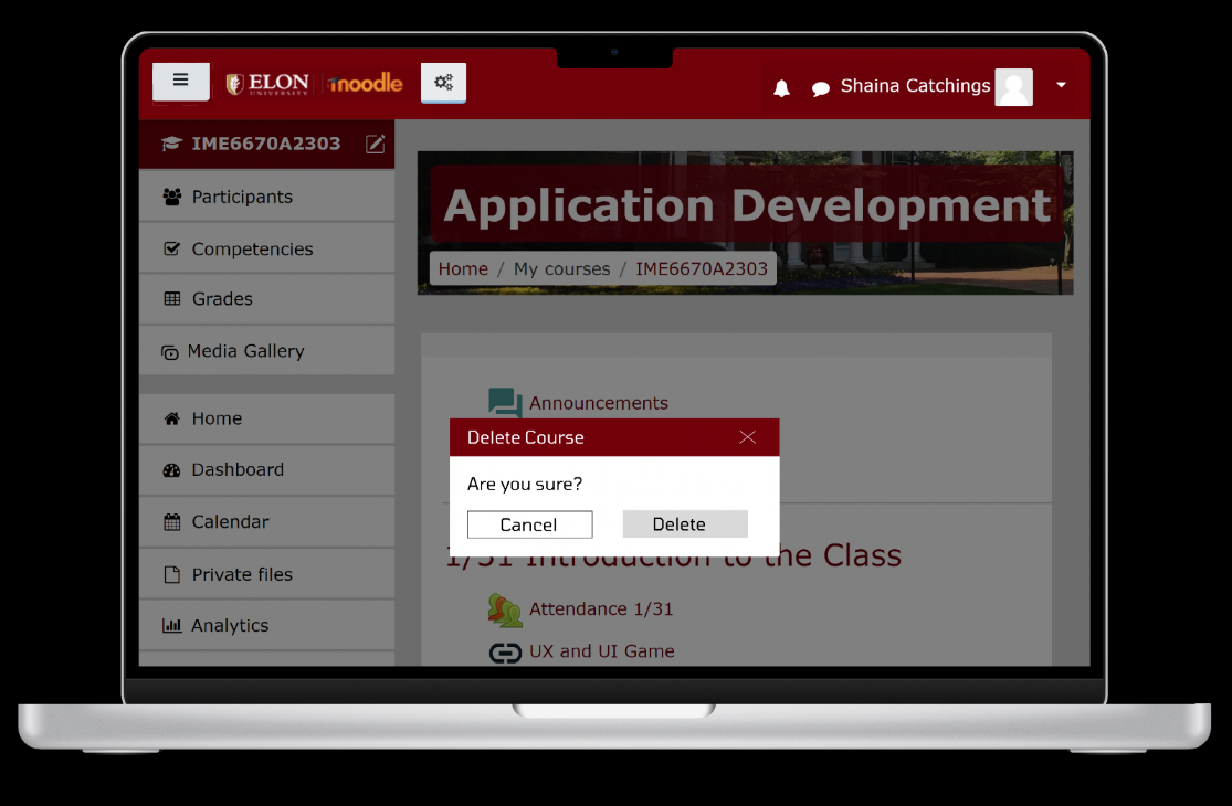
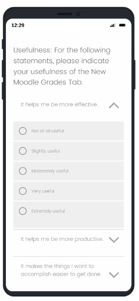
For this application redesign project, our team chose Moodle for our interface. As students, we constantly interact with Moodle and see shortcomings in terms of user experience and interface designs. Colleges in the US use different grade platforms and we knew of the ways those interfaces simplified certain processes that Moodle lacked. We felt like we could improve upon the solid foundation Moodle gave us to produce something impactful.
It should be noted that the focal points of this project that were designated to me included the sidebar design question and data collection and analysis.
Teammates: Ashley Soderberg and Liv Archer